


GuidoSplitPane
Overview
A GuidoSplitPane is a container object that allows the form to be split into two visible areas. The pane can be split either vertically or horizontally. There is a visible divider between the two sections that can be resized by the user when the form is displayed.
The two sections of a GuidoSplitPane are normally set to contain another Guido container object such as a GuidoPanel which will further contain Guido widget objects such as fields and combo boxes. It is also common that the left side of a split pane contains a GuidoTree with the right side containing a panel that has its context changed according to the current selection on the tree. See GuidoTree for further information.
Synopsis
GuidoSplitPane Name Body
Description
The GuidoSplitPane command when processed will define two sections on the form with a visible divider between then. The pane can be divided vertically or horizontally by using the -orientation switch discussed below.
Arguments
Name Name is a unique identifier that you assign and is used to differentiate this object from other Guido objects in the form definition.
Body The body of the split pane may contain a number of switches to modify the default behaviour. The body begins with an opening curly brace and ends with a closing curly brace. If there is no required body the curly braces {} are required as a place holder for this argument.
Switches The following switches can be used to modify the default behaviour of the split pane:
| -orientation HORIZONTAL_SPLIT|VERTICAL_SPLIT | The -orientation switch specifies whether the split
pane is horizontal giving left and right sections (the divider is actually
vertical) or vertical giving top and bottom sections (the divider is actually
horizontal). The default is for a horizontal split.
-orientation HORIZONTAL_SPLIT -orientation VERTICAL_SPLIT |
| -divider_location %|size | The -divider_location switch gives you flexibility
in where to place the visible divider. It can be specified as a percentage
of the available space or as an actual width/height value.
-divider_location 25% -divider_location 30 |
| -expandable true/false | The -expandable switch determines whether a set of
small triangle icons are placed on the divider to allow each side of the
split pane to be quickly imploded or expanded. By default this option
is false meaning the icon controls are not present.
-expandable true -expandable false |
| -continuous_layout true/false | The -continuous_layout switch tells the split pane
layout manager whether it should reposition the objects in each section
as the user resizes by moving the divider or resizing the form. By default
this is set to true-continuous_layout true -continuous_layout false |
| -resize_weight 1|0 | The -resize_weight switch determines which of the
two sections of the split pane receives extra space when the user resizes
the form. A value of 1 sets the left/top section to consume any
extra space while a value of 0 sets the right/bottom section to
receive any extra space. The default is 0.
-resize_weight 1 -resize_weight 0 |
Common Guido switches reference
Examples
Example 1
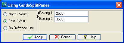
The example form below demonstrates using a GuidoSplitpane to divide the form into two sections. The left side contains a GuidoButtonGroupPanel to get a section method with the right hand side being context sensitive to the selected method. It uses an Overlay Layout Manager to display only the items of relevance.
# GuidoSplitPane Example 1
# define the form
set formDef {
  GuidoForm form {
    -label "Using GuidoSplitPanes"
    -default_buttons
    -layout BoxLayout X_AXIS
    GuidoSplitPane splitPane {
      -orientation HORIZONTAL_SPLIT
      -divider_location "30%"
      -continuous_layout true
      -resize_weight 1
      -expandable true
      GuidoButtonGroupPanel sectionMethod {
        -layout GridLayout 3 1
        GuidoRadioButton b1 {
          -caption "North - South"
          -selected_value "NS"
        }
        GuidoRadioButton b2 {
          -caption "East - West"
          -selected_value "EW"
        }
        GuidoRadioButton b3 {
          -caption "On Refrence Line"
          -selected_value "RL"
        }
      }
      GuidoPanel right {
        -layout OverlayLayout
        GuidoPanel NSpanel {
          -layout CentreLineLayout
          -dependency {"[$sectionMethod getCurrentValue]" == "NS"}
          GuidoField northing1 {
            -label "Northing 1"
            -width 10
            -format double
            -null false
          }
          GuidoField northing2 {
            -label "Northing 2"
            -width 10
            -format double
            -null false
          }
        }

        GuidoPanel EWpanel {
          -layout CentreLineLayout
          -dependency {"[$sectionMethod getCurrentValue]" == "EW"}
          GuidoField easting1 {
            -label "Easting 1"
            -width 10
            -format double
            -null false
          }
          GuidoField easting2 {
            -label "Easting 2"
            -width 10
            -format double
            -null false
          }
        }
        GuidoPanel RLpanel {
          -layout CentreLineLayout
          -dependency {"[$sectionMethod getCurrentValue]" == "RL"}
          GuidoFileBrowserField reflineLoc {
            -label "Ref line file"
            -width 20
            -file_mask "*.str"
            -link reflineId
            -null false
          }
          GuidoField reflineId {
            -label "Ref line Id"
            -width 10
            -format integer
            -null false
          }
        }
      }
    }
  }
}
# Create and run the form
SclCreateGuidoForm formHandle $formDef {}
$formHandle SclRun {}
|
See Also
Guido
GuidoForm
Common guido switches
GuidoPanel
Layout Managers