GuidoPanel
Overview
A GuidoPanel is a rectangular region that is placed on a form to facilitate positioning Guido widgets and subsequent containers including subordinate GuidoPanels. The purpose of the panel is to assist with laying out information and widgets on the form. When a form is defined an initial panel is automatically created for you to begin placing other Guido objects in. Simple forms usually don't require the addition of subsequent panels unless a particular layout is required.
The initial panel placed on a form uses the CentreLineLayout manager to position objects onto it. This layout manager can be overridden by using the layout switch on the GuidoForm command. When you place other GuidoPanels in a form the default layout manager is the BoxLayout in a horizontal direction (X_AXIS). See the reference on Guido Layout managers below for information on layout managers.
GuidoFiller objects are often used in panels to act as place holders for the layout manager when it places objects into positional slots on the form. GuidoFillers can also be configured to take up a certain amount of width or height in the form to help the aesthetics of the form.
Synopsis
GuidoPanel Name Body
Description
The GuidoPanel command when processed will define a rectangular region on the form that can contain any number of subsequent Guido widgets and containers. All contents of the panel must be defined using switches and other Guido objects defined within the body of the panel.
Arguments
Name Name is a unique identifier that you assign and is used to differentiate this object from other Guido objects in the form definition.
Body The body of the panel will contain any Guido switches used to modify the default behaviour of the panel and then further definitions of Guido containers and widgets. The body begins with an opening curly brace and ends with a closing curly brace. If there is no required body the curly braces {} are required as a place holder for this argument.
Switches A GuidoPanel will understand the common Guido switches for objects and containers. See the description on the layout managers below for detailed information on panel layouts.
Common Guido switches reference
Guido Layout Managers
Overview
A layout manager is the logic that determines where objects are placed into Guido containers. Normally the only container objects that you would alter the default layout manager for are the GuidoForm and GuidoPanels. Other containers such a GuidoScrollPane or a GuidoTable have special purpose layout managers that should never be changed.
To change the logic or the rules that apply to a panel, the standard Guido container switch -layout is used. Depending upon the layout manager chosen the switch may require further arguments to set the default rules of the layout. The sections below cover the rules for the different layout managers and describe these additional arguments.
Behaviour of the -label Switch
Before discussing layout managers it is important to know what happens when you specify the -label switch on any Guido object. For all Guido widgets when you specify the -label switch a new Guido object called a GuidoLabel is created automatically; layout managers will place this automatic GuidoLabel prior to placing the actual object (that specified the -label). This behaviour will also happen for Guido containers unless the -border borderType true switch is used to place the label as part of the containers border.
CentreLineLayout
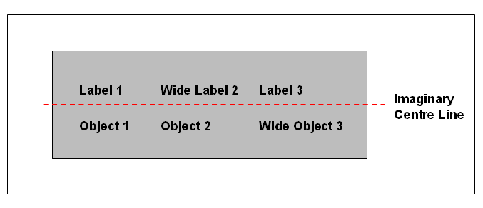
The CentreLineLayout is the default layout placed onto a GuidoForm. Its logic is to lay components out around an imaginary centre line on the form. It places components from left to right, from top to bottom.
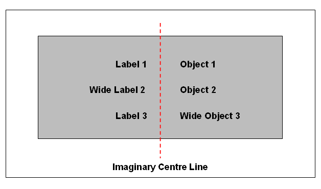
The CentreLineLayout switch can take two optional arguments to change its default behaviour. These are described in the table below
| -layout CentreLineLayout direction | The direction argument must be specified as either vertical | horizontal It determines the direction of the centre line on the panel; vertical meaning it runs top to bottom, and horizontal meaning it runs left to right across the panel. The default setting for direction is vertical. -layout CentreLineLayout vertical -layout CentreLineLayout horizontal |
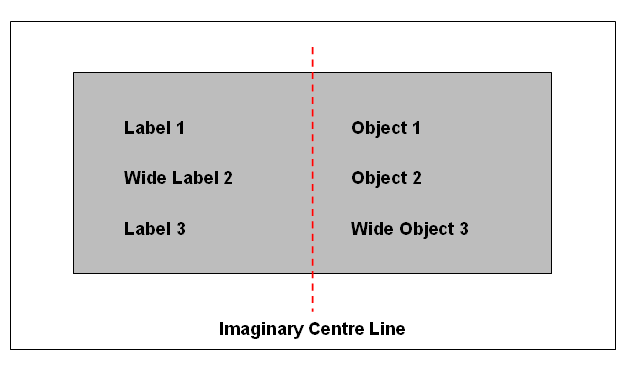
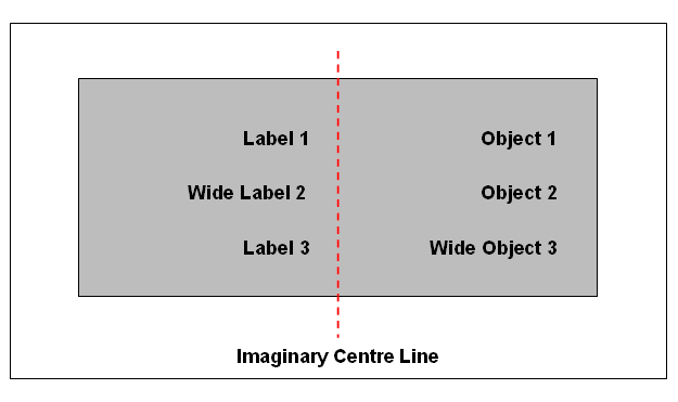
| -layout CentreLineLayout direction alignment | The alignment argument must be specified as one of centred | left | right | perimeter It determines how objects are aligned to the centre line. By default objects are centred around the centre line meaning that they are positioned as close as possible to the line as shown in the diagram above. The perimeter setting is the opposite where the Guido objects will be positioned a far away from the centre line as possible along the edges of the panel. The left setting causes objects on the left hand side to be aligned along the left edge of the panel and objects in the right hand side of the panel to be aligned left on the edge of the centre line. The right setting reverses this and aligns objects on the left hand side on the edge of the centre line and objects on the right hand side are aligned to the right edge of the panel. -layout CentreLineLayout vertical perimeter -layout CentreLineLayout vertical left -layout CentreLineLayout vertical right -layout CentreLineLayout horizontal left Note that when you wish to change the alignment you must also specify the directional argument as well as above |
Example CentreLineLayouts
-layout CentreLineLayout vertical left
-layout CentreLineLayout vertical right
-layout CentreLineLayout vertical perimeter
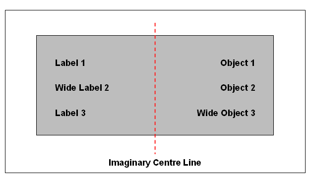
-layout CentreLineLayout horizontal left
BoxLayout
The BoxLayout is the default layout placed onto a GuidoPanel. It is used commonly when inserting GuidoPanels into GuidoPanels to achieve a specific look on the form. The logic of the BoxLayout is to insert objects next to each other in either a horizontal or vertical direction. The BoxLayout will not wrap when the visible extent of the panel is reached in the direction of the axis but will still insert the objects in the axis direction. If you want to wrap objects see the FlowLayout manager below.
| -layout BoxLayout direction | The direction argument must be specified as either X_AXIS | Horizontal | Y_AXIS | Vertical X_AXIS and horizontal mean that objects are inserted from left to right across the panel, this is the default. Y_AXIS and vertical mean that objects will be inserted from top to bottom down the panel. -layout BoxLayout X_AXIS -layout BoxLayout Y_AXIS |
Example BoxLayouts
-layout BoxLayout X_AXIS
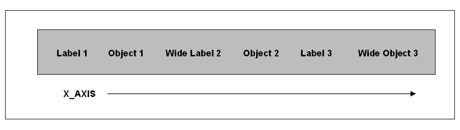
-layout BoxLayout Y_AXIS
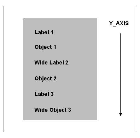
FlowLayout
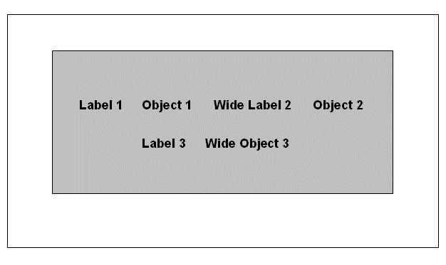
The FlowLayout manager is similar to the BoxLayout when used in the X_AXIS direction. The difference with the FlowLayout is that the objects are centred in the available space and it will also wrap around when the visible limit of the panel has been reached. That is it fills objects from left to right until the limit of the panel is reached and then moves down the panel and begins inserting another row of objects from left to right.
| -layout FlowLayout alignment | The alignment argument must be specified as either Left | Right | Centre It determines how a particular object is aligned within its layout space. Note that this does not alter the direction of placement in the panel -layout FlowLayout Right |
| -layout FlowLayout alignment hgap vgap | The hgap and vgap arguments allow you control
over spacing of objects, both horizontally and vertically. You specify
the amount of space for both arguments as an integer value representing
the number of pixels to place between objects. The default value for both
arguments is 5.
-layout FlowLayout Left 20 5 -layout FlowLayout Left 5 10 Note that you must specify the alignment argument first when using the horizontal and vertical arguments |
-layout FlowLayout
GridLayout
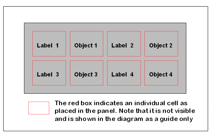
The GridLayout is useful in situations where a number of objects and labels are required to be lined up both vertically and horizontally. The layout rules divide the panel into equal sized cells according to the number of rows and columns that the grid will have. By default the grid has only 1 column and 1 row, ie 1 cell.
When both the number of rows and the number of columns have been set to non-zero values the number of columns specified is ignored. Instead, the number of columns is determined from the specified number or rows and the total number of components in the layout. So, for example, if three rows and two columns have been specified and nine components are added to the layout, then they will be displayed as three rows of three columns. Specifying the number of columns affects the layout only when the number of rows is set to zero.
| -layout GridLayout rows columns | Specify as an integer value the number of rows and columns
that the grid is to have.
-layout GridLayout 6 6 -layout GridLayout 0 4 |
| -layout GridLayout rows columns hgap vgap | The hgap and vgap arguments allow you control
over spacing of objects both horizontally and vertically in the grid (ie
the space between cells). You specify the amount of space for both arguments
as an integer value representing the number of pixels to place between
objects. The default value for both arguments is 5.
-layout GridLayout 6 6 20 5 -layout GridLayout 1 4 5 10 Note that you must specify the row and column arguments first when using the hgap and vgap arguments |
-layout GridLayout 2 4
BorderLayout
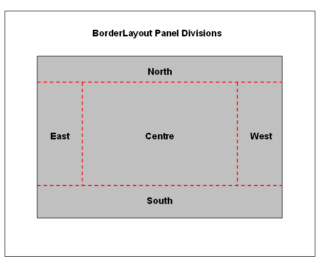
The BorderLayout is a special purpose manager that defines distinct regions on the panel referenced with compass names of North, South, East and West with a middle region of Center. Objects are placed into these different regions by using the -position switch as part of their definition. See the examples below for further information.
The diagram below best illustrates the break up of the panel but note that the Centre region of the panel occupies any available space, with the other regions only using what is required for the object(s) placed within them.
OverlayLayout
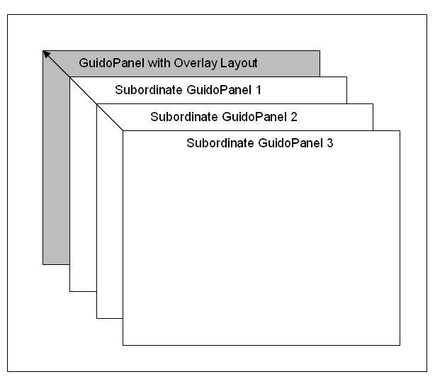
The OverlayLayout is used to share a panel with a number of other objects, usually GuidoPanels. It is extremely useful when used with Guido dependencies where subordinate panels can be made visible or invisible. Think of the overlay manager like a deck of cards where only the top card is visible at any one time and it is up to the OverlayLayout to determine which card is on top of the deck.
The GuidoTabbedPane and GuidoPanels using an OverlayLayout manager are very similar in context. With a GuidoTabbedPane it is the script user who has control over the panel that is currently visible (by clicking onto a tab) but with panels and an overlay layout it is under the script writers control as to which panel is visible.
Examples
Example 1
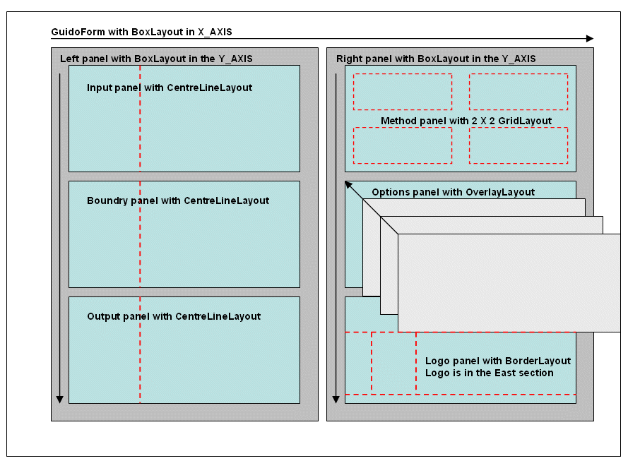
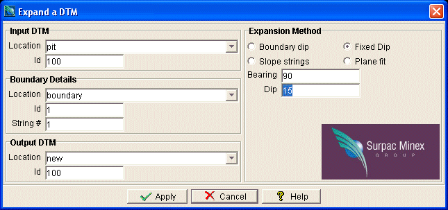
This example form demonstrates how to achieve a specific layout of components by layering a number of GuidoPanels together with different layout managers. The example uses all of the layout managers described above. The layout diagram below describes visually where the panels are inserted and what layout managers are used to achieve the desired layout.
# Example - Using a combination of GuidoPanels and layout managers
# Define the form and store into a Tcl variable called formDef
set formDef {
  GuidoForm aForm {
    -label "Expand a DTM"
    -default_buttons
    -layout BoxLayout X_AXIS
    # this is the entire left side of the form
    GuidoPanel leftSide {
      -layout BoxLayout Y_AXIS
      # the input panel which has a border and title
      GuidoPanel inputPanel {
        -label "Input DTM"
        -border etched true
        -layout CentreLineLayout
        GuidoFileBrowserField dtmLocation {
          -label "Location"
          -width 25
          -format none
          -null false
          -file_mask "*.dtm"
          -link dtmId
        }
        GuidoField dtmId {
          -label "Id"
          -width 10
          -format integer
          -null false
        }
      }
      # the boundary panel which has a border and title
      GuidoPanel BoundaryPanel {
        -label "Boundary Details"
        -border etched true
        -layout CentreLineLayout
        GuidoFileBrowserField bndryLocation {
          -label "Location"
          -width 25
          -format none
          -null false
          -file_mask "*.str"
          -link bndryId
        }
        GuidoField bndryId {
          -label "Id"
          -width 10
          -format integer
          -null false
        }
        GuidoField bndrystr {
          -label "String #"
          -width 10
          -format integer
          -null false
        }
      }
      # the output panel which has a border and title
      GuidoPanel outputPanel {
        -label "Output DTM"
        -border etched true
        -layout CentreLineLayout
        GuidoFileBrowserField outLocation {
          -label "Location"
          -width 25
          -format none
          -null false
          -file_mask "*.dtm"
          -link outId
        }
        GuidoField outId {
          -label "Id"
          -width 10
          -format integer
          -null false
        }
      }
    }
    # this is the entire right side of the form
    GuidoPanel rightSide {
        -label "Expansion Method"
        -border etched true
      -layout BoxLayout Y_AXIS
      # lets use a grid layout on the button group panel
      GuidoButtonGroupPanel method {
        -layout GridLayout 2 2
        GuidoRadioButton b1 {
          -caption "Boundary dip"
          -height 1
          -selected_value "Boundary"
        }
        GuidoRadioButton b2 {
          -caption "Fixed Dip"
          -height 1
          -selected_value "Fixed"
        }
        GuidoRadioButton b3 {
          -caption "Slope strings"
          -height 1
          -selected_value "Slope"
        }
        GuidoRadioButton b4 {
          -caption "Plane fit"
          -height 1
          -selected_value "Plane"
        }
      }
      # OK lets try a overlay layout for the options panel so we only see options that are valid
      # for the expansion method picked above. The subordinate panels all occupy the same space
      GuidoPanel optionsPanel {
        -layout OverlayLayout
        GuidoPanel optionsPanel1 {
          -layout CentreLineLayout
          -dependency {"[$method getCurrentValue]" == "Boundary"}
          GuidoField smooth {
            -label "Smoothing factor"
            -width 10
            -format double
            -null false
          }
        }
        GuidoPanel optionsPanel2 {
          -layout CentreLineLayout
          -dependency {"[$method getCurrentValue]" == "Fixed"}
          GuidoField bearing {
            -label "Bearing"
            -width 10
            -format double
            -null false
          }
          GuidoField dip {
            -label "Dip"
            -width 10
            -format double
            -null false
          }
        }
        GuidoPanel optionsPanel3 {
          -layout CentreLineLayout
          -dependency {"[$method getCurrentValue]" == "Slope"}
          GuidoFileBrowserField slopeLocation {
            -label "Location"
            -width 20
            -format none
            -null false
            -file_mask "*.str"
            -link slopeId
          }
          GuidoField slopeId {
            -label "Id"
            -width 10
            -format integer
            -null false
          }
        }
      }
      # finally lets use a border layout to stick a logo on the right hand edge. Note the use
      # of a filler to ocupy some space so the logo is positioned at the bottom edge of the form
      GuidoPanel logoPanel {
        -layout BorderLayout
        GuidoFiller fil {
          -position North
          -height 2
        }
        GuidoLabel logo {
          -position East
          -icon "images/surpac_lgo.jpeg"
        }
      }
    }
  }
}
# now create the form which will use the above values as defaults
SclCreateGuidoForm formHandle $formDef {}
# display the form and test for the user pressing cancel at the end
$formHandle SclRun {}
if {"$_status" == "cancel"} {
  puts "Macro cancelling"
  return
}
|
A Flow Diagram to Show the Panel Hierarchy and Layout Managers used on the Example Form Above