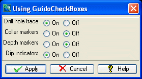
GuidoRadioButton and GuidoButtonGroupPanel
Overview
A GuidoRadioButton provides the same functionality as a GuidoCheckBox in that it can be used to select one of two possible states, for example true/false, yes/no, on/off, etc. Their appearance is round rather than the square look of a check box when rendered on the form.
GuidoRadioButton's can be combined into a GuidoButtonGroupPanel which creates a logical connection between all the radio buttons contained within the group. When defined within a GuidoButtonGroupPanel only one of the buttons can be selected using the same principle as old style car radios, where only one button could be pushed in at any one time.
The GuidoButtonGroupPanel is both a Guido container object, as it contains GuidoRadioButtons, and also a Guido widget because you access the value of the selected button through the name of the button group in your scripts. The container aspects of the GuidoButtonGroupPanel are exactly the same as that of a GuidoPanel and it will understand all of the switches that are available for a GuidoPanel including the different layout mechanisms. See the GuidoPanel reference page for further information.
GuidoRadioButtons when combined within a GuidoButtonGroupPanel provide a descriptive manner to display and gather information on the form. This is similar to GuidoComboBox in that a set of possible values can be selected, but the actual list of values are displayed on the form with a circle icon for selection as opposed to a drop down list. If you are defining a large number of radio buttons in the group you may want to consider using a GuidoComboBox instead. Overloading your form with too many buttons can make it harder for the script user to read and understand.
Synopsis
GuidoRadioButton Name Body
Description
The GuidoRadioButton command when processed will define a small circle on the form which when selected with the mouse or space bar on the keyboard will either 'turn on' or 'turn off'. When 'turned on' the circle will become filled to indicate this.
Arguments
Name Name is a unique identifier that you assign and is used to differentiate this object from other Guido objects in the form definition. The name you assign will become the name of a variable in the Tcl interpreter that will contain the value as entered into the field on the form.
Body The body of the radio button may contain a number of switches to modify the default behaviour. The body begins with an opening curly brace and ends with a closing curly brace. If there is no required body the curly braces {} are required as a place holder for this argument.
Switches The following switches can be used to modify the default behaviour of the radio button:
| -caption text | The -caption switch allows you to specify some extra
text to appear with the radio button in addition to the standard label
switch. The caption text is actually part of the radio button widget and
can be selected with the mouse. The purpose of the caption is to give
a little more context to the radio button. See the examples below for
more information.
-caption "A0" -caption "Inside" |
| -caption_placement left|right|top|bottom | The -caption_placement switch gives you flexibility
in placing the caption text in relation to the actual radio button icon.
By default the caption is placed to the right of the radio button.
-caption_placement right -caption_placement bottom |
| -selected_value value | The -selected_value switch sets the actual value that
you want returned from the radio button when it has been selected. By
default the text true is returned but usually you will want to
change this to improve the context of the returned value of the button,
especially when you are grouping a number of buttons. For example if you
were using a GuidoButtonGroupPanel to select a plotting sheet size you
would more than likely assign sheet sizes as the selected values for each
of the buttons.
-selected_value "A0" -selected_value "A4" |
| -unselected_value value | The -unselected_value switch sets the actual value
that you want returned from the radio button when it has not been selected.
By default the text false will be returned.
-selected_value "no" -selected_value "off"When using radio buttons in a GuidoButtonGroupPanel you will not need to use this switch because you will access the script users input via the name of GuidoButtonGroupPanel, which will take on the selected value of the button that is selected. See the examples below for further information. |
It is common when using a standard -label switch with a radio button to also use the -height switch to set a height of 1 for the widget. This is because the default height for a radio button icon is slightly bigger than 1 character in height and so by setting a height of 1 it will correctly line the widget up with the label. See the common Guido switches reference and the examples below for further information. Common Guido switches reference
Synopsis
GuidoButtonGroupPanel Name Body
Description
The GuidoButtonGroupPanel command when processed will define a panel area on the form which will contain the radio buttons that are defined within the body of the command. All radio buttons defined in the body are logically related so that only one of the buttons can be selected at any one time. The returned value of the button group panel is the selected value of the button that is selected when the form is applied.
Arguments
Name Name is a unique identifier that you assign and is used to differentiate this object from other Guido objects in the form definition. The name you assign will become the name of a variable in the Tcl interpreter that will contain the value as entered into the field on the form.
Body The body of the button group panel may contain a number of switches to modify the default behaviour and GuidoRadioButton definitions. The body begins with an opening curly brace and ends with a closing curly brace. If there is no required body the curly braces {} are required as a place holder for this argument.
Switches The GuidoButtonGroupPanel can accept any of the common Guido object and Guido container switches. It behaves the same as a GuidoPanel with regard to form layout features. See the Common Guido widget reference for details and the examples below for further information. Common Guido switches reference
Examples
Example 1
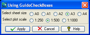
The example form below demonstrates using GuidoRadioButtons and GuidoButtonGroupPanels to gather different inputs for a plotting macro. Note the use of the -default switch on the GuidoButtonGroupPanels to set a default button to be selected. See also how it is the name of the GuidoButtonGroupPanel that is used to access the values after the form is applied and not the individual GuidoRadioButtons.
# GuidoRadioButton Example 1
# define the form
set formDef {
  GuidoForm form {
    -label "Using GuidoCheckBoxes"
    -default_buttons
    GuidoButtonGroupPanel sheetSize {
      -label "Select sheet size"
      -default A3
      GuidoRadioButton A0 {
        -caption "A0"
        -height 1
        -selected_value "A0"
      }
      GuidoRadioButton A1 {
        -caption "A1"
        -height 1
        -selected_value "A1"
      }
      GuidoRadioButton A2 {
        -caption "A2"
        -height 1
        -selected_value "A2"
      }
      GuidoRadioButton A3 {
        -caption "A3"
        -height 1
        -selected_value "A3"
      }
      GuidoRadioButton A4 {
        -caption "A4"
        -height 1
        -selected_value "A4"
      }
    }
    GuidoButtonGroupPanel scale {
      -label "Select plot scale"
      -default 1000
      GuidoRadioButton b250 {
        -caption "1:250"
        -height 1
        -selected_value "250"
      }
      GuidoRadioButton b500 {
        -caption "1:500"
        -height 1
        -selected_value "500"
      }
      GuidoRadioButton b1000 {
        -caption "1:1000"
        -height 1
        -selected_value "1000"
      }
    }
  }
}
# Create and run the form
SclCreateGuidoForm formHandle $formDef {}
$formHandle SclRun {}
puts "Plotting on a $sheetSize sheet at a scale of 1 is to $scale"
|
Example 2
The example form below demonstrates using GuidoRadioButtons and GuidoButtonGroupPanels to gather different inputs for a drill hole display macro. Note the use of the -default switch on the GuidoButtonGroupPanels to set a default button to be selected. See also how it is the name of the GuidoButtonGroupPanel that is used to access the values after the form is applied and not the individual GuidoRadioButtons. This example shows an alternative way of displaying data than was used in example 2 in the GuidoCheckBox reference.
# GuidoCheckBox Example 2
# define the form
set formDef {
  GuidoForm form {
    -label "Using GuidoCheckBoxes"
    -default_buttons
    GuidoCheckBox drillholeTrace {
      -caption "Drill hole trace"
      -caption_placement left
      -selected_value "yes"
      -unselected_value "no"
      -default "yes"
    }
    GuidoCheckBox collarMarkers {
      -caption "Collar markers"
      -caption_placement left
      -selected_value "yes"
      -unselected_value "no"
      -default "yes"
    }
    GuidoCheckBox depthMarkers {
      -caption "Depth markers"
      -caption_placement left
      -selected_value "yes"
      -unselected_value "no"
      -default "yes"
    }
    GuidoCheckBox dipIndicators {
      -caption "Dip indicators"
      -caption_placement left
      -selected_value "yes"
      -unselected_value "no"
      -default "no"
    }
  }
}
# Create and run the form
SclCreateGuidoForm formHandle $formDef {}
$formHandle SclRun {}
puts "Drill hole trace $drillholeTrace"
puts "Collar markers $collarMarkers"
puts "Depth markers $depthMarkers"
puts "Dip indicatorss $dipIndicators"
|