


GuidoTabbedPane
Overview
A GuidoTabbedPane is a container object that allows the form to be separated into a number of overlayed panes (panels) that contain a header item know as the tab. The current pane is brought to the top by the user selecting the tab. Normally the GuidoTabbedPane contains GuidoPanels which define each tab in the tabbed pane. The panels contain the various Guido widgets to collect information such as fields and combo boxes.
The concept of the tabbed pane is similar to using GuidoPanels and the Overlay Layout Manager. The difference is that the user has control over what information is available rather than the script, as is the case with overlays.
Synopsis
GuidoTabbedPane Name Body
Description
The GuidoTabbedPane command when processed will define a container section on the form. The number of tabs that are created depends upon the number of objects (usually GuidoPanels) that are placed into the body of the tabbed pane. The label on the tab is derived from the label set onto the subordinate object with the -label switch.
Arguments
Name Name is a unique identifier that you assign and is used to differentiate this object from other Guido objects in the form definition.
Body The body of the tabbed pane may contain a number of switches to modify the default behaviour and the object definitions of the items (usually GuidoPanels) to be placed into the tabbed pane. The body begins with an opening curly brace and ends with a closing curly brace. If there is no required body the curly braces {} are required as a place holder for this argument.
Switches The following switches can be used to modify the default behaviour of the tabbed pane:
| -tab_position top|bottom|left|right | The -tab_position switch specifies where to place
the tab section. By default the tabs are placed at the top of each of
the objects inserted into the tabbed pane. By using the tab_position switch
you can specify to have the tabs placed on the either the top, bottom,
left, or right.
-tab_position left -tab_position bottom |
| -selected_index indexNo | The -selected_index switch allows you to set the tab
pane to be the current one when the form is first displayed. Specify the
index number of the tab as an integer value begining at zero, ie the first
tab is index 0, the second tab is index 1, etc.
-selected_index 0 -selected_index 3 |
Common Guido switches reference
Examples
Example 1
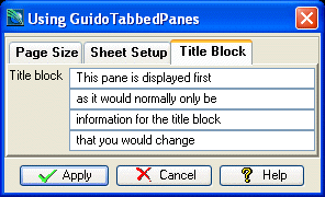
The example form below demonstrates using a GuidoTabbedPane to gather information for a plotting macro. Note the use of the selected_index switch to make the title block tab the current one when the form is displayed.
# GuidoTabbedPane Example 1
# define the form
set formDef {
  GuidoForm form {
    -label "Using GuidoTabbedPanes"
    -default_buttons
    -layout BoxLayout X_AXIS
    -next_focus title1
    GuidoTabbedPane tabbedPane {
      -selected_index 2
      GuidoPanel sheetPanel {
        -label "Page Size"
        -layout CentreLineLayout
        -height 4
        GuidoButtonGroupPanel sheetSize {
          -label "Select sheet size"
          -default A3

          GuidoRadioButton A0 {
            -caption "A0"
            -height 1
            -selected_value "A0"
          }
          GuidoRadioButton A1 {
            -caption "A1"
            -height 1
            -selected_value "A1"
          }
          GuidoRadioButton A3 {
            -caption "A3"
            -height 1
            -selected_value "A3"
          }
          GuidoRadioButton A4 {
            -caption "A4"
            -height 1
            -selected_value "A4"
          }
        }

        GuidoButtonGroupPanel scale {
          -label "Select plot scale"
          -default 1000

          GuidoRadioButton b250 {
            -caption "1:250"
            -height 1
            -selected_value "250"
          }
          GuidoRadioButton b500 {
            -caption "1:500"
            -height 1
            -selected_value "500"
          }
          GuidoRadioButton b1000 {
            -caption "1:1000"
            -height 1
            -selected_value "1000"
          }
        }
      }
      GuidoPanel sheetPanel {
        -label "Sheet Setup"
        -layout CentreLineLayout
        GuidoCheckBox border {
          -label "Border"
          -height 1
          -caption "yes"
          -selected_value "BORD"
          -unselected_value "NOBD"
        }

        GuidoComboBox drawingArea {
          -label "Drawing area"
          -width 10
          -value_in DRAW VA0L VA0M VA3L VA3M VA4L VA4M
          -null false
        }
        GuidoComboBox grid {
          -label "Grid"
          -width 10
          -value_in YXA0 ZXA0 YXA3 ZXA3 YXA4 ZXA4
          -null false
        }
        GuidoComboBox titleBlock {
          -label "Grid"
          -width 10
          -value_in NMA0 NMA3 NMA4
          -null false
        }
      }
      GuidoPanel titlePanel {
        -label "Title Block"
        -layout CentreLineLayout
        GuidoField title1 {
          -label "Title block"
          -width 20
          -format none
        }
        GuidoFiller fil2 {}
        GuidoField title2 {
          -width 20
          -format none
        }
        GuidoFiller fil3 {}
        GuidoField title3 {
          -width 20
          -format none
        }
        GuidoFiller fil4 {}
        GuidoField title4 {
          -width 20
          -format none
        }
      }
    }
  }
}
# Create and run the form
SclCreateGuidoForm formHandle $formDef {}
$formHandle SclRun {}
|
Example 2
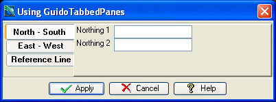
The example form below demonstrates using a GuidoTabbedPane to get some sectioning coordinates. Note the use of the -tab_position switch to place the tabs on the left side of the container.
# GuidoTabbedPane Example 2
# define the form
set formDef {
  GuidoForm form {
    -label "Using GuidoTabbedPanes"
    -default_buttons
    -layout BoxLayout X_AXIS
    GuidoTabbedPane tabbedPane {
      -tab_position left
      GuidoPanel NSpanel {
        -label "North - South"
        -layout CentreLineLayout
        -height 4
        GuidoField northing1 {
          -label "Northing 1"
          -width 10
          -format double
        }
        GuidoField northing2 {
          -label "Northing 2"
          -width 10
          -format double
        }
      }
      GuidoPanel EWpanel {
        -label "East - West"
        -layout CentreLineLayout
        GuidoField easting1 {
          -label "Easting 1"
          -width 10
          -format double
        }
        GuidoField easting2 {
          -label "Easting 2"
          -width 10
          -format double
        }
      }
      GuidoPanel RLpanel {
        -label "Reference Line"
        -layout CentreLineLayout
        GuidoFileBrowserField reflineLoc {
          -label "Ref line file"
          -width 20
          -file_mask "*.str"
          -link reflineId
        }
        GuidoField reflineId {
          -label "Ref line Id"
          -width 10
          -format integer
        }
      }
    }
  }
}
# Create and run the form
SclCreateGuidoForm formHandle $formDef {}
$formHandle SclRun {}
|
See Also
Guido
GuidoForm
Common guido switches
GuidoPanel
Layout Managers