


Forms
You use forms to enter data and parameters to control the way in which the functions work. A typical form is shown below.
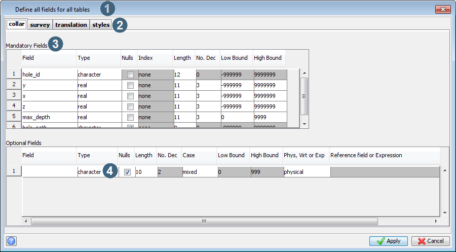
Some components of a form are:
| Component | Description |
|---|---|
| 1. title bar | The band across the top of every form. Each header has a title that describes the purpose of the form. |
| 2. tab | Groups together a set of related fields at a high level. Often all the fields on one tab relate to a single task that you must do to achieve a goal. |
| 3. section (also called panel) | Groups together a set of related fields at a lower level.. |
| 4. input field |
Input fields allow you to enter data or parameters for a function. They can be simple text fields, selection (combo) boxes, option buttons, check boxes or a number of other input types. The types you will encounter (or wish to use in building your own forms are shown in Graphical User Interface Design Objects - Guido. Data validation is performed on input field contents when you either move to another field or click the Apply button. If data validation fails, a message is displayed in the Message window and the cursor remains in the input field to allow you to correct the error. |
The active field
If there are one or more input fields on a form then there is always one field which is referred to as the active field. The active field is identified by a colour which is different to other fields on the form. To change the active field, that is to move to another field, you may use a number of methods. These are listed below.
- Use the Arrow Keys, Tab, or Shift-Tab. This makes the next or previous field on the form the active field. If there is no next field then the first field will become the active field. The TAB key behaves differently to the other keys when the active field is in a region with a scroll bar.
- Use the mouse. By positioning the mouse inside any of the input fields and pressing the button on the mouse you can make the selected field the active field.
Form buttons
Most forms have three buttons spaced along the bottom of the form: a help button, Apply, and Cancel.

| Button | Description |
|---|---|
| Help |
Opens the Surpac help, displaying a help topic about the form
For information on how to start form and field help, see Shortcut menus for fields. |
| Apply | Indicates that you have finished with the form, that you will accept the inputs and processing will continue. All inputs are validated on the form. If the inputs do not match any of the validation criteria, a warning message is displayed in the Message window and the form is redisplayed for correction. |
| Cancel | Indicates that the form is no longer required and that it will be closed. If the function currently running has more than one form, it is likely that the an earlier form for the function will be displayed. |
 Note: In addition, form help and field help are available. These are short descriptions of the form as a whole, or the current active field.
This help appears in a small scrolling region (like the
Note: In addition, form help and field help are available. These are short descriptions of the form as a whole, or the current active field.
This help appears in a small scrolling region (like the There are keyboard shortcuts for these buttons.
| Button | Keyboard shortcut |
|---|---|
| Help | F3 |
| Apply | F2 |
| Cancel | ESC |