


GuidoChart component
The GuidoChart component is a powerful component which allows you to create a chart on any SCL form. It can create any of (presently) 20 chart types, which can be changed and updated very easily. The charts are also complete with a nice right-click menu and zoom capability using the mouse. The menu allows the chart to be Saved and Printed. More detail on these features can be found below.There are only a couple of things to remember when creating a chart component :
- The data must be filled into the chart after the form is created
- There are a number of different commands to set the data, you must choose the one that suits the type of chart you wish to draw. Failure to do this will lead to a blank chart.
There is an example in the software to show you everything the GuidoChart component is capable of. The CHART EXAMPLES function creates a form with one of each type of chart on it, filled with random data. This will give you an idea what is possible. The script that generates this form can be found in <INSTALLATION DIR>/resource/forms/testGuidoChart.tcl. It is a very simple form that you should be able to follow easily. There is another example below for more information.
The basic structure of a GuidoChart command is basically the same as any other Guido component :
GuidoChart cht0 {
    -width 20
    -height 10
    -legend true
    -chartType "Bar"
    -chartTitle "Bar"
    -xAxisLabel "x-axis"
    -yAxisLabel "y-axis"
    -action initial {[setChart $cht0]}
  }
|
Please note the following :
- The width and height must be set explicitly, or the chart may not be drawn correctly (if at all)
- The -legend specifies whether a legend should be drawn for the graph. The legend is always placed at the bottom of the chart, and is included in the height specified (meaning the chart itself will be smaller)
- The -chartTitle, -xAxisLabel and -yAxisLabel commands are simply text labels and may be ignored.
- The -action initial is what makes it all work. This is a callback action that occurs when the form starts being displayed. The procedure specified will set the data and then call a final method called drawChart which will perform the drawing of the chart. This line is critical to the correct working of the chart.
There are 4 different commands used to set the values in a chart. You should only use one method per chart, and the method you need to use depends on the chart type you are using. If you use the wrong method for the chart you are trying to display, the chart will be blank. The command you use is generally called multiple times, once for each of the data values you wish to see on the chart.
In the above example, a procedure called setChart has been created to draw the chart. The setChart method (as you could see from the example script below) simply contains 2 things :
- Multiple calls to a set method (see table below)
- A single call to the drawChart method.
This is all that is required to get a chart to draw. The set commands are listed below :
| Setting command | Parameters |
| setCategoryValue | setCategoryValue $categoryName $xValue $yValue
|
| setXYValue | setXYValue $categoryName $xValue $yValue
|
| setXYZValue | setXYZValue $categoryName $xValue $yValue $zValue
|
| setPieValue | setPieValue $categoryName $xValue
|
For example, the code below would constitute a working setChart method for the Bar chart defined above. It generates 20 random numbers between 0 and 20 and generates the bar graph from that.
proc setChart { cht } {
  for { set i 0} {$i < 20} {incr i} {
    set y [expr rand() * 20]
    $cht setCategoryValue "Category 1" $i $y
  }
  $cht drawChart
}
|
If you were using a different chart type, you may need to use a method other than setCategoryValue based on the table above.
Chart Types
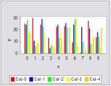
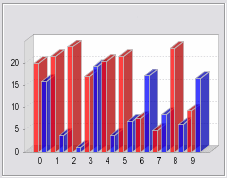
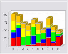
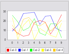
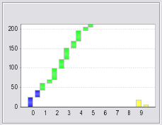
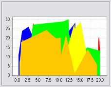
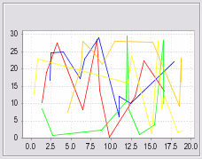
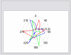
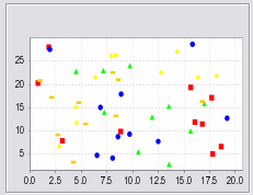
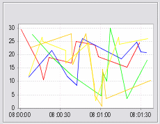
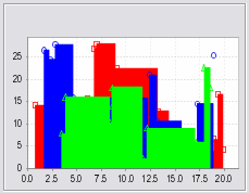
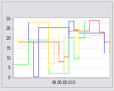
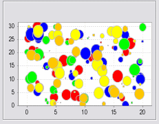
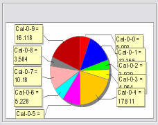
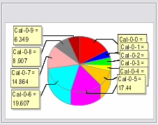
There are 20 chart types to choose from. The following table shows the chart type, the set command required to populate the chart with values, and an example of the chart.
| Chart Type | Setting Command | Example |
| Bar | setCategoryValue |
|
| 3D Bar | setCategoryValue |
|
| Stacked Bar | setCategoryValue |

|
| 3D Stacked Bar | setCategoryValue |
|
| Line | setCategoryValue |
|
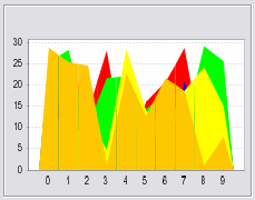
| Area | setCategoryValue |
|
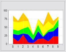
| Stacked Area | setCategoryValue |
|
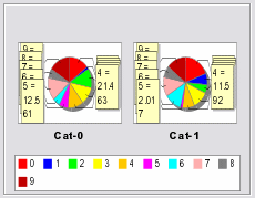
| Multiple Pie | setCategoryValue |
|
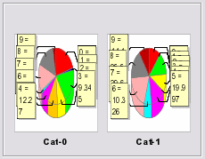
| 3D Multiple Pie | setCategoryValue |
|
| Waterfall | setCategoryValue |
|
| Area XY | setXYValue |
|
| Line XY | setXYValue |
|
| Polar | setXYValue |
|
| Scatter | setXYValue |
|
| Time Series | setXYValue |
|
| Step Area XY | setXYValue |
|
| Step XY | setXYValue |
|
| Bubble | setXYZValue |
|
| Pie | setPieValue |
|
| 3DPie | setPieValue |
|
Example Script
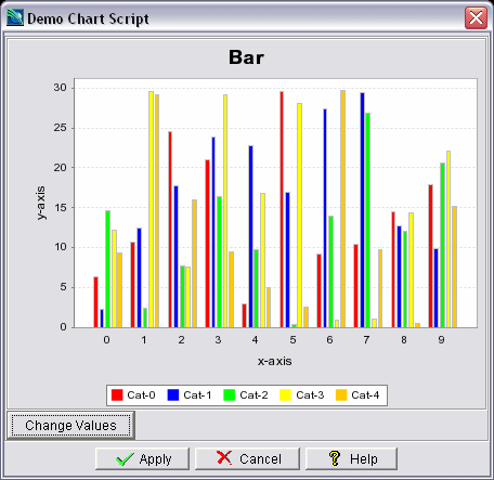
The following script will (by default) display a bar chart, with a button to change the chart's values. You can change the chart to any of the type (above) by simply changing the -chartType command and the value of the valType parameter to make sure the correct setting command is used.
set form {
  proc setChart { cht valType cats number xlimit ylimit} {
    for {set k 0} {$k < 3} {incr k} {
      for {set j 0} {$j < $cats} {incr j} {
        set category "Cat-$j"
        for { set i 0} {$i < $number} {incr i} {
          set x [expr rand() * $xlimit]
          set y [expr rand() * $ylimit]
          set z [expr rand() * 5]
          if { $valType == 1 } {
            $cht setXYZValue $category $x $y $z
          } elseif { $valType == 2 } {
            $cht setCategoryValue $category $i $y
          } elseif { $valType == 3 } {
            $cht setPieValue "$category-$i" $x
          } elseif { $valType == 4 } {
            $cht setXYValue $category $x $y
          }
        }
      }
      $cht drawChart
    }
  }
  proc runProc { cht } {
    setChart $cht 2 5 10 20 30
  }
  GuidoForm sampleform {
    -default_buttons
    -label "Demo Chart Script"
    -layout BoxLayout Y_AXIS
    GuidoChart cht0 {
      -width 40
      -height 20
      -legend true
      -chartType "Bar"
      -chartTitle "Bar"
      -xAxisLabel "x-axis"
      -yAxisLabel "y-axis"
      -action initial {[setChart $cht0 2 5 10 20 30]}
    }
    GuidoButton chgButton {
      -caption "Change Values"
      -action valueChanged {[runProc $cht0]}
    }
  }
}
SclCreateGuidoForm form_handle $form {
}
$form_handle SclRun {}
|
This form appears as follows:
Modification of the Chart
After you have created the chart in Guido, you can easily modify the chart. All charts have the ability to change ranges, axis scales, zooms and a number of other features. Right-click on the chart to access these features. You can also zoom by using the left mouse button.
You have the option to change the properties of the chart (axis labels, colours, axis ranges etc), print the chart to any windows printer, save the chart to an image, and zoom in and out.
This is a standard feature on all types of chart.