Chart Display Properties
Overview
You can change chart properties, such as color of histograms, line types of variograms, and Titles.
Procedure
Right click within a chart, then select Properties from the popup menu.
The Chart Properties dialog is displayed.
There are four tabs:
 Title Tab
The title is the text that appears at the top of the chart. You can modify the display of the title on this tab.
| Form Feature | Description |
|---|---|
| Show Title | Select this option to display the title. Unselect the checkbox to hide the title. |
| Text | Enter the text to display as the Title. The Title text can contain any keyboard characters (a-z, 0-9, !@#, etc.). |
| Font | Choose Select... to display the Font Selection dialog, where you can select from any currently installed font. |
| Color | Choose Select... to display the Color Selection dialog, where you can select a color from a "swatch", or define a color using RGB or HSB values. |
You can change the display and orientation of axes as well as the chart area border and background on the Plot tab. The Plot Tab contains three tabs:
The Domain axis is normally displayed as the X axis.
| Form Feature | Description |
|---|---|
| Label | The text to display along the Domain axis. The text can contain any keyboard characters (a-z, 0-9, !@#, etc.). |
| Font | Choose Select... to display the Font Selection dialog, where you can select from any currently installed font. |
| Color | Choose Select... to display the Color Selection dialog, where you can select a color from a "swatch", or define a color using RGB or HSB values. |
You can change the display of the Domain axis numeric labels as well as tick marks on this tab.
| Form Feature | Description |
|---|---|
| Show tick labels | Select this option to display the numeric labels along the axis. Unselect the checkbox to hide the numeric labels. |
| Tick label font | Choose Select... to display the Font Selection dialog, where you can select from any currently installed font. |
| Show tick labels | Select this option to display the ticks along the axis. Unselect the checkbox to hide the ticks. |
You can change the scale of the Domain axis on this tab.
 Caution: Setting axis scale values using this option is not recommended. The best practice is to use View
axes scale in the Basic Statistics Window or
Set axis limits in the Variogram Window.
Caution: Setting axis scale values using this option is not recommended. The best practice is to use View
axes scale in the Basic Statistics Window or
Set axis limits in the Variogram Window.
| Form Feature | Description |
|---|---|
| Auto-adjust range | Select this option to set the minimum and maximum values of the axis equal to the minimum and maximum of the data. Unselect the checkbox to use define minimum and maximum range values. |
| Minimum range value | Enter the minimum value for this axis. It can be any real number that is less than the maximum range value. |
| Maximum range value | Enter the maximum value for this axis. It can be any real number that is greater than the minimum range value. |
The Range axis is normally displayed as the Y axis.
| Form Feature | Description |
|---|---|
| Label | Enter the text to display along the Range axis. The text can contain any keyboard characters (a-z, 0-9, !@#, etc.). |
| Font | Choose Select... to display the Font Selection dialog, where you can select from any currently installed font. |
| Color | Choose Select... to display the Color Selection dialog, where you can select a color from a "swatch", or define a color using RGB or HSB values. |
You can change the display of the Domain axis numeric labels as well as tick marks on this tab.
| Form Feature | Description |
|---|---|
| Show tick labels | Select this option to display the numeric labels along the axis. Unselect the checkbox to hide the numeric labels. |
| Tick label font | Choose Select... to display the Font Selection dialog, where you can select from any currently installed font. |
| Show tick labels | Select this option to display the ticks along the axis. Unselect the checkbox to hide the ticks. |
You can change the scale of the Range axis on this tab.
Caution: Setting axis scale values using this option is not recommended. The best practice is to use
View
axes scale in the Basic Statistics Window or
Set axis limits in the Variogram Window.
| Form Feature | Description |
|---|---|
| Auto-adjust range | Select this option to set the minimum and maximum values of the axis equal to the minimum and maximum of the data. Unselect the checkbox to use define minimum and maximum range values. |
| Minimum range value | Enter the minimum value for this axis. It can be any real number that is less than the maximum range value. |
| Maximum range value | Enter the maximum value for this axis. It can be any real number that is greater than the minimum range value. |
Note: the orientation of the Domain and Range axes can be swapped.
You can change the scale of the Range axis on this tab.
| Form Feature | Description |
|---|---|
| Outline stroke | Select this option to change the thickness of the border around the chart. |
| Outline paint | Choose Select... to display the Color Selection dialog, where you can select a color from a "swatch", or define a color using RGB or HSB values. |
| Background paint | Choose Select... to display the Color Selection dialog, where you can select a color from a "swatch", or define a color using RGB or HSB values. |
You can control the colour and display of text on the border around the chart data on the Other tab.
| Form Feature | Description |
|---|---|
| Draw anti-aliased | Select this option to display the text in
the border as anti-aliased. Selecting this option will generally result in a better display of text fonts. |
| Background paint | Choose Select... to display the
Color Selection
dialog, where you can select a color from a "swatch", or define a
color using RGB or HSB values. The chosen color will be displayed as the background border color outside the chart area. |
You can control the display of lines and markers on the Styles tab. The items presented on this tab will vary between Basic Statistics and Variogram Windows.
You can change the color of the histogram bars on the Histogram tab.
| Form Feature | Description |
|---|---|
| Line weight | not used |
| Colour | not used |
| Top colour | Choose Select... to display the
Color Selection
dialog, where you can select a color from a "swatch", or define a
color using RGB or HSB values. The colour selected will appear at the top of each histogram bar, and blend into the bottom colour. |
| Bottom colour | Choose Select... to display the
Color Selection
dialog, where you can select a color from a "swatch", or define a
color using RGB or HSB values. The colour selected will appear at the bottom of each histogram bar, and blend into the top colour. |
You can change the style and color of the cumulative frequency line on the Histogram tab.
| Form Feature | Description |
|---|---|
| Style | You can display the cumulative frequency curve as a line, or as a line with markers. |
| Marker symbol | You can select the symbol to be
displayed at each point on the
cumulative frequency curve. This option is only used if the Style is set to Line and markers. |
| Marker size | You can change the size of the
marker. Valid values are from 1 to 30.
This option is only used if the Style is set to Line and markers. |
| Line weight | Choose Select... to change the thickness of the cumulative frequency curve. |
| Colour | Choose Select... to display the
Color Selection
dialog, where you can select a color from a "swatch", or define a
color using RGB or HSB values. The cumulative frequency line will be displayed using the selected colour. |
| Form Feature | Description |
|---|---|
| Variogram trace | You can display the experimental variogram as a line with markers, or as markers. |
| Marker symbol | You can change the symbol to be
displayed at each point on the
experimental variogram. |
| Marker size | You can change the size of the
marker. Valid values are from 1 to 30.
|
| Line pattern | Choose Select... to
change the pattern of the
line displayed for the experimental variogram. This option is only used if the Style is set to Line and markers. |
| Line weight | Choose Select... to
change the thickness of the experimental
variogram line. This option is only used if the Style is set to Line and markers. |
| Colour | Choose Select... to display the
Color Selection
dialog, where you can select a color from a "swatch", or define a
color using RGB or HSB values. The line will be displayed using the selected colour. |
| Label font | Choose Select... to display the Font Selection dialog, where you can select from any currently installed font. The selected font will be used to display labels (such as number of pairs) plotted above each point on the experimental variogram. |
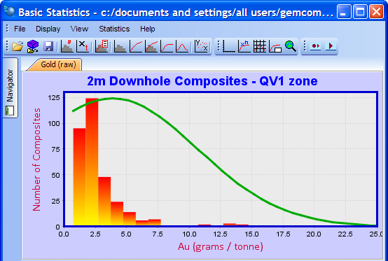
Example #1: Basic statistics histogram and normal distribution curve