Display XY Scatter diagram
Overview
Function:
You can use this function to produce an xy plot of two variables on optionally transformed axes, for example, log-log plots, log-linear plots etc.
 Note: When loading the data you must have specified at least two description fields to contain variables for this function to work.
Procedure
- Choose Display > XY Scatter diagram or click the
 icon in the Basic Statistics window.
Note: You must have previously loaded at least two variables for this function to work.
Any missing values are ignored.
For example, if a D1 value exists for a point, but the D2 value is blank, nothing will be displayed for that data pair on the XY scatter diagram.
| Form Feature |
Description |
| X Variable, Y Variable |
Select the variables providing the X and Y coordinates of the plot.
If descriptive variable names were entered to the Basic Statistics or Stats Reload functions the you can choose the variables by these names.
If no names were supplied then you must refer to the variables by their generic names, e.g. D1, D2, etc.
|
| Transform, Constant |
Select the transformation (and, if necessary, the transformation constant) by which to transform the appropriate axis.
See STATS TRANSFORM for more information on transformations. |
| Draw as (Lines | Markers) |
The plotted points may be drawn as markers (scattergrams) or as a line.
Note: The order of points when plotted in a line will be that of the original string file. |
| Quantile-Quantile |
Q-Q plots are plot of the quantiles of the first data set against the quantiles of the second data set.
A quantile is a fraction or percent of points below the given value.
A 25% quantile is the point at which 25% (quartile) of the data fall below and 75% fall above that value.
Both axes are in units of their respective data sets.
The actual quantile level is not plotted.
To see the quantile values, select Display/hide graphed values.
The number of points to plotted is entered in the text box adjacent to the QQ tick box.
This allows the details on the chart to be varied according to the type of quantile required.
The default is 100 points (percentiles) allowing 1% increments (100/100). Entering 4 will give quartiles (100/4) and 10 deciles (100/10).
Advantages of the QQ plot is that the sample sizes do not need to be equal.
Many distributional aspects can be simultaneously tested.
For example, shifts in location, shifts in scale, changes in symmetry, and the presence of outliers can all be detected from this plot.
A 45-degree reference line is also plotted.
If the two sets come from a population with the same distribution, the points should fall approximately along this reference line.
The greater the departure from this reference line, the greater the evidence for the conclusion that the two data sets have come from populations with different distributions.
Altering the chart axis lengths by changing the window size (that is, square to rectangular window) results in the reference line appearing to be no longer at 45o.
Q-Q plots are similar to probability plots, but are preferable for graphical estimation of distribution parameters and capability indices, whereas probability plots are preferable for graphical estimation of percentiles.
|
| Linear Regression |
Selecting the linear regression tick box will cause the line of best fit to be drawn on the chart along.
The method used to calculate this line is the 'least square method'.
The equation of the line and correlation coefficient are shown under the chart heading.
Least Square Method Equation y = ax + b where slope = a and intercept = b
slope =

intercept =
 - slope * - slope * 
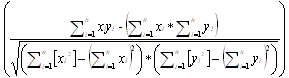
Correlation Coefficient Equation
The correlation coefficient (r) descriptive measure between -1 and 1 and is a measure of the reliability of the linear relationship between the x and y values.
A value of r = -1 indicates that as X increase Y gets smaller, if r = 0 there is no correlation and if r=1 there is an exact linear relationship between x and y.
R-squared is a way of emphasising the fit of line with linear reliability.
The closer it is to 1, the better your model while a value of 0 indicates there is no correlation between the variables.
Correlation Coefficient(r) =
|
- Fill in the fields on the XY Plot form.
- Click Apply.
The XY scatter diagram and optionally, QQ plot or Linear Regression line are displayed.



 XY Plotform.